Your brand’s color isn’t just a design choice—it’s a decision that can shape how people feel, trust, and engage with your business. In fact, studies show that people make subconscious judgments about a product within 90 seconds, and up to 90% of that judgment is based on color alone.
If you’re not thinking strategically about your brand’s color palette, you’re missing a massive opportunity to connect, convert, and build loyalty. Let’s break down how the psychology of color works—and how it influences your buyers more than you might think.
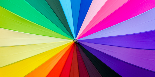
Why Color Choice Matters in Branding
Think of your brand color as your emotional handshake. It’s the first thing people notice, and the feeling it gives them sticks—whether they realize it or not. Different colors trigger different emotions and associations, and when used well, they help reinforce what your brand stands for.
What Different Colors Communicate
Here’s a quick rundown of what common brand colors tend to signal:
Red: Energy, Urgency, and Boldness
Red is the color of action. It increases heart rate and creates a sense of urgency. That’s why it’s so common in clearance signs, fast food, and entertainment.
- Used by: Netflix, Coca-Cola, YouTube
- Best for: Brands that want to feel bold, youthful, or demand quick engagement
- Works well in: Sales campaigns, calls-to-action, impulse-buy environments
Red says, “Look at me,” but use it with intention. Too much can feel aggressive or overwhelming.
Blue: Trust, Stability, and Intelligence
Blue is one of the most widely used brand colors because it inspires confidence and calm. It’s the color of logic, serenity, and security.
- Used by: IBM, LinkedIn, PayPal
- Best for: Financial services, healthcare, SaaS companies, B2B brands
- Works well in: Websites, corporate communications, technology platforms
Blue is a staple for brands that want to be taken seriously. In fact, it’s often ranked as the most trustworthy color globally.
Yellow: Optimism, Friendliness, and Clarity
Yellow is your brand’s way of smiling at the world. It’s warm, attention-grabbing, and naturally draws the eye—especially in moderation.
- Used by: McDonald’s, Snapchat, IKEA
- Best for: Brands that want to be playful, welcoming, and accessible
- Works well in: Retail, family-focused brands, tech startups
Too much yellow can feel chaotic, but as an accent, it creates memorable pop and a sense of optimism.
Green: Growth, Health, Sustainability
Green is associated with freshness, tranquility, and wealth. It signals renewal, harmony, and environmental awareness.
- Used by: Spotify, Whole Foods, Land Rover
- Best for: Wellness brands, eco-conscious products, financial services
- Works well in: Branding for organic products, fintech, nature-based goods
It’s a versatile color that can signal luxury or sustainability depending on the tone—deep forest green vs. bright lime can send very different messages.
Black: Sophistication, Luxury, Authority
Black is bold. It’s sleek, stylish, and oozes confidence. When used correctly, it can elevate your brand and give it a timeless, high-end feel.
- Used by: Chanel, Nike, Apple
- Best for: Fashion, luxury goods, technology, high-ticket services
- Works well in: Minimalist designs, luxury packaging, brand identity systems
Black isn’t emotionless—it’s powerful. But without thoughtful balance, it can also feel cold or impersonal.
Purple: Creativity, Wisdom, Imagination
Purple is complex. It bridges warm and cool, and it has long been associated with royalty, spirituality, and big thinking. It’s perfect for brands with an imaginative or intellectual bent.
- Used by: Hallmark, Twitch, Cadbury
- Best for: Creative services, education, wellness, beauty
- Works well in: Brand storytelling, experiential design, cultural campaigns
Use purple when you want to make people pause, think, and feel something deeper.
Orange: Playfulness, Confidence, Affordability
Orange is fun. It communicates movement, positivity, and enthusiasm—and it’s often used to suggest value without sacrificing personality.
Used by: Nickelodeon, Amazon, The Home Depot
Best for: E-commerce, food and beverage, education, entertainment
Works well in: Digital ads, onboarding flows, youth-focused branding
Orange feels vibrant and fearless. It’s a great alternative when red feels too intense or yellow too light.
Color is a Feeling. Is Your Brand Giving the Right One?
The move toward personalization and brand authenticity is only growing stronger. That means your brand’s visual identity—especially your color palette—needs to reflect your values, tone, and audience expectations from the first glance.
At Linx, a full-service New York marketing agency, we don’t pick colors because they look good—we choose them because they work. We dig deep into audience behavior, industry standards, and emotional resonance to create color strategies that elevate your brand and drive results.
Build a Brand That Feels as Good as It Performs
Whether you’re launching a new venture or rethinking your current identity, your colors should work for your brand. Let’s build something that looks great, makes sense, and connects where it counts.
Ready to bring your brand to life through color? Contact Linx today!